Senin, 29 Juli 2013

ShopHouse - Responsive HTML5 Template


Description

Theme Information:

ShopHouse is a simple and clean, professional theme suitable for any business or portfolio, and it’s created by using HTML5 and CSS3 techniques. With a responsive design it is easily usable with any device, without removing any content.

Main Features:

  • Responsive HTML5 and CSS3 design;
  • Premium Revolution Slider (save $12);
  • PostSlider;
  • Responsive Image Grid Slider;
  • Google Map with pins;
  • Portfolio filtering;
  • Latest tweets;
  • Ajax/PHP Contact form;
  • Dropdown navigation;
  • 14 Page Templates:
    • Home with Revolution Slider;
    • Home with ImageGrid Slider;
    • Home with Google Map;
    • About Us;
    • Elements;
    • Layouts;
    • Typography;
    • House Description;
    • Blog with Left Sidebar;
    • Blog with Right Sidebar;
    • Full-width Blog;
    • Single Post
    • Portfolio Page;
    • Contacts;
  • 11 PSD files (save $10);
  • All files are well commented;
  • Color variations;
  • Background patterns;
  • Documentation.

Important: Please note that the images are not included in the pack.

Designed by CrazyPixels

Flag Counter

Enjoy!


Category : site-templates/corporate/business | Rating: 5.0 out of 5.

MIO HTML Template


Description

MIO HTML, is a responsive clean one page template

- Responsive HTML5&CSS3 templates.

- PHP contact form with AJAX validation.

- Responsive Lightbox.

- jQuery Scroll functionality.

- 2 layouts options.

- Cross browser support.

- Template is good optimized for Chrome, Safari, Firefox, Opera 14, IE 8, IE 9.

- CSS3 animations not available for older browsers.

- Included social icons: twitter, facebook, google+, pinterest, youtube, linkedin.

- Google fonts Integration.

- Custom Print CSS stylesheet.

- All files are commented.

- Extensive Documentation.


Category : site-templates/specialty-pages/resume-cv | Rating: 5.0 out of 5.

Eternity - Mobile Website


Description

Features

  • Modern navigation
  • Google Fonts
  • Swipe function
  • 9 Pages
  • Documentation
  • Responsive Slider
  • Working contact form
  • Gallery + Fullscreen slideshow


Category : site-templates/mobile | Rating: 5.0 out of 5.

FOXY One Page Responsive HTML Template


Description

Update

  • 30 May 2013 – UPDATE
- Fixed Contact Form

Theme description

FOXY is a clean responsive HTML template base on Skeleton Framework.

It is built with the HTML5 and CSS3 latest technologies, but at the same time make it compatible with older browser versions.

Suitable for those who want to show their work in a simple and interesting way.

Ideal for a web and graphic designers, personal and professional use, photographers etc.

Theme Features:

  • Creative Portfolio Template
  • HTML5 and CSS3
  • Responsive Design
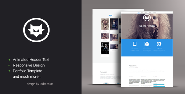
  • Animated Header Text
  • Animated Services Icons
  • Animated Social Icons
  • Animated Portfolio
  • jQuery Masonry for portfolio
  • prettyPhoto for displaying images
  • Google Map
  • Working contact form
  • Ajax Contact Form

Responsive Design

Pictures used in Live Preview by Deviantart author Panter:

Note

PICTURES FROM LIVE PREVIEW ARE NOT INCLUDED IN DOWNLOAD FILE, BUT THEY ARE REPLACED WITH PLACEHOLDERS

Hope you like it, if you have any problem please feel free to send me a PM.

Thank you for your time and don’t forget to rate :-)


Category : site-templates/creative | Rating: 5.0 out of 5.

Magica - One Page, Fully Ajaxable HTML Template


Description

Magica is the dark one-page html template for the creative agency, freelancer or general business. Strong lines, dark skin and a bunch of super-awesome features make Magica the perfect template for the creative agency, freelancer or general business

Features:

  • Minimalist design
  • Fully Responsive and Retina Ready
  • Fully Ajaxable
  • Easily customizable
  • 960 Grid system
  • HTML5 + CSS3
  • Smart Navigation
  • ThemePile Sliders
  • Page Ajax Preloader
  • LastFM Integration
  • Filtrable Portfolio
  • Dark Skin for Google Maps
  • Background Parallax
  • Extensive Documentation

Screenshots:

Credits:

  • Icons: Minicons Ultimate Pack (http://www.webalys.com/minicons/ultimate-pack.php)


Category : site-templates/creative | Rating: 5.0 out of 5.

Webby | Mobile & Tablet Responsive Template


Description

For 10$ you get a mobile and tablet version! You can disable the tablet version if you only need it for mobile! 10$ for two templates in one!

General Features

  • Custom jQuery code.
  • Page preloader with fader!
  • Optimized for all types of mobile screens!
  • WebApp Ready!
  • AJAX/PHP Contact Form with validation!
  • Touch Swipe image slider!
  • Colorbox image gallery!
  • Photoswipe touch image gallery!
  • Full retina support for all graphic elements!
  • 800 icons availalble!
  • 40 icon lists availalble!
  • Google fonts integration!

Typograpghy features!

  • 1 text column!
  • 2 text columns!
  • 3 text columns!
  • 1 column with icon
  • 2 columns with icon
  • 3 columns with icon
  • 1 column with image
  • 2 columns with image
  • 3 columns with image!
  • Blockquote with icons!
  • Blockquote without icons!
  • CSS3 Highlighted text paragraphs
  • CSS3 Dropcaps text style!
  • CSS3 Table!
  • CSS3 Web 2.0 buttons
  • CSS3 Minimal buttons
  • List with icons!
  • Classic lists with numbers or bullet!
  • Thumbnail adaptive blog post!
  • Fullwidth blog post!
  • Ads widget in blog!
  • Recent widget in blog
  • Comments widget
  • Replies widget!

jQuery features!

  • jQuery Swipe Slider
  • jQuery Photoswipe thumbnail gallery!
  • jQuery Colorbox 1 column gallery!
  • jQuery Colorbox 2 column gallery!
  • jQuery Colorbox filtrable gallery!
  • jQuery Checkboxes ( retina ready )
  • jQuery Radioboxes ( retina ready )
  • jQuery On/Off Toggle! ( retina ready )
  • jQuery +/- Toggle ( retina ready )
  • jQuery Tabs
  • jQuery Classic Notifications ( retina ready )
  • jQuery Big Notifications! ( retina ready )
  • jQuery Header notifications!

Epsilon mobile framework! What is it

Epsilon is the most advanced and easiet to use mobile framework we’ve ever built! It’s made in such fashion that you’ll have all possible elements styled up for this specific template and all you’ll have to do is call them to your page!

Is Epsilon harder to use than coding old fashion way?

NO! It’s actually far far easier! All elements are dynamic, you can use as many as you want, they are just copy paste, replace with your information, done! That’s all!

How is Epsilon/Resepina is built?

Epsilon is the backbone of Resepina , it has 2 stylesheets and Resepina has the style.css and graphic elements!
  • style.css, has all the design elements of the template!
  • framework-style.css, includes all typography sizes and colors, element styles, and design features for the elements in Epsilon, styled for Resepina
  • framework.css, includes the sizes, alignment, spacing, visual hierachy of the elements! This is basically the engine of Epsilon!


Category : site-templates/mobile | Rating: 5.0 out of 5.

Rundon - Responsive Underconstruction Template


Description

Rundon is a fully responsive Underconstruction or coming soon Page html template.This can be used for companies that are underconstruction page or coming soon page online with their bussines or any other site.

This template has 12 variations of color style.

Feature:

  • Responsive Design
  • HTML5 & CSS3 Validated( http://validator.w3.org )
  • Revolution Slider ($12 Value )
  • Social Media Link
  • Workings AJAX Subscribe Form
  • Nicely commented code
  • Google Web Fonts
  • feature Service
  • Easily Customizable
  • Flickr Feed
  • Twitter Feed
  • Detailed Documentation


Included: Slider Revolution by ThemePunch


If you like our template, please, share your love with us and rate it

Note:

Images in live preview not included.

You can replace with your own images.

Thank You !


Category : site-templates/specialty-pages/under-construction | Rating: 5.0 out of 5.